Saturday 23 August 2014

As the Crow Flys

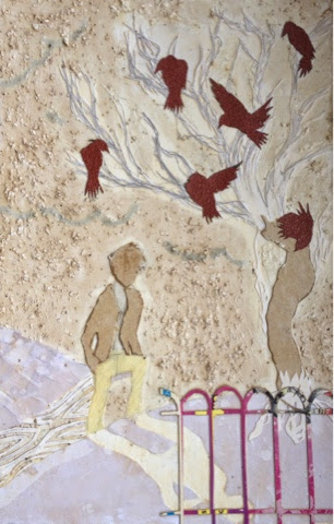
This is only going to be a real short post but it's one I thought would be nice to write; it's a little tale of the short phase I had around Christmas that evolved long drives, drawing tall spindly trees and... crows. They're fascinating aren't they? So mysterious and sinister yet beautiful. Anyway I loved drawing them in a sort of rushed, sketchy style with a scratchy dip pen.


Terrible photo eeek! This photo is an example of some of the ones I took around Christmas of the crows.


Using inks and watercolours in as many different and experimental ways as possible, I was able to recreate the tree from the photo.         


Pardon the abnormal and slightly out of proportion girl thingy, it was a Saturday evening experiment that turned mad.
A few days later I was delighted to finally visit Curwen Studio in Linton for a session of Drypoint Etching - a wonderful gift from my folks and one I would definitely recommend to anyone interested in printmaking! Whilst there I used this sketch for a drypoint print. The presses we used printed a treat, something for me to think about in the future. 


There were so many techniques I could use, my favourite being masking table and sandpaper. 

A few days later I started to wonder if I could use masking tape and other textures to create an image, a process known as collograph. I used a number of cards and papers to build up my image ad then coated the whole thing in varnish to seal it.


There were so many different ways of applying the ink to create different effects. With this form of printing, EVERYTHING is unpredictable, you've just got to go with it. This is what I got: 


I got a few good prints from it but nothing compared to the quality I could have gotten with an etching press at Curwen. There is so much that this form of printmaking has to offer and I can't wait to explore it but for now I'm just going to sit and sketch a few design for some wood engravings.

Have a nice summer.

Will Baker Illustrator 

Friday 8 August 2014

Tablet Sketching

Well welcome back to my little corner of the internet where hopefully you have come for a bit of easy reading about sketching on a tablet...but...most likely have stumbled across hopelessly on a unpredictable journey across the web.
So as many of you know, I´m going through a phase of recapping what I've been up to in the year, going into more detail with the bits I liked best - today's post is on tablet sketching.
In my opinion, I think that my iPad is the best!!! I do...and I always use it for socialising and listening to music. I know that a lot of people think they're not all that great, with all the new technology and people's days are just being wasted. However I also use my iPad for drawing. It's a brilliant past time and really good for mapping ideas without wasting paper so it IS economical in that sense. Even if you're not a drawer or an artist, you can still use these apps to your advantage. Just drawing simple ideas can spark your creativity and before you know it you've got something you quite like the look of. 
There are so many drawing apps available for tablets nower days, I can't really comment on them since I have only used one but a friend of mine showed me another that has a whole selection of coloured pencils. It's worth having a little look about and seeing what you feel would suit you best - you will have to pay for some but the fee isn't much and is worth it. Of course certain apps will only be available for apple and not windows and vice-versa. Sadly the app I use - Procreate - is as far as I'm aware not available for windows which is a shame as it is very nice to use but I'm certain that there will be apps just as good as this one.

Anyway cracking on, I like to use Procreate to draw characters as well as draw my ideas. It takes some getting used to but if you stick at it and take your time then the end results can be very pleasing. I have a sort of routine when it comes to drawing these characters - that is when I've thought about the idea enough that it is in my head quite vividly. This is't a tutorial as such but more of a walk-through that you may find useful. I have used a similar principle when using acrylic so I think it is quite effective but of course each to their own.

First of all I map out - in a bright and thick brush - a sort of basic shape for the character:


I add a little darker colour for the facial elements before drawing the line art over the top:


I then add the skin tone of the face except for the eyes and lips which I do on a separate layer. For this I tend to use a light and dark shade of grey and a few browns that are saved into my pallet so I can change between them without losing the colours. I add them generously with a wide and rustic brush not worrying about smoothness until I've got a general idea of where the colours are laying. Then I blend them with a smudging tool before neatening the edges with an eraser:


The line art is then deleted OR hidden and the eyes and mouth are painted in using a similar method with different colours. For the eyebrows I paint a single tone of colour (usually a dark beige) and then add texture with dark and fine brush strokes:


For this design, the character was wearing a sort of scarf, so I mapped out the design of the scarf and then added tone before using some of the brushes to create a sort of fabric texture:


I tend to have problems with backgrounds, that is that I love drawing the characters but then find doing backgrounds a mediocre task - I have to get over this, however the good thing is that you can make the background less detailed than the foreground which takes less time. Using all sorts of brushes and colours I was able to create a city background with a sunlight effect: 

                          
So that was my little cover on drawing with Procreate, for this I used an Adonit Jot Pro stylus - a neat and precise bit of kit that makes the experience that little bit fluid-er. Anyway that's it for now, I hope you enjoyed it. I'm always interested in seeing and hearing about your own art experiences and as always, am open for comments and questions. Make sure you share and follow this blog and be sure to check out my Bloglovin profile.
Have a nice summer,
Will Baker Illustrator
Sunday 3 August 2014

The Art of Art Final Pieces

So as it's been a whole year since we last saw each other (my doesn't time fly) I thought it would be well worth the while to give a little more detail on some of my favourite parts of the year - one of which is my first GCSE Art final pieces.

During the first half term of school we were given the project of "Structures - 2D"; for these we were assigned the task of choosing a structure - man made or natural - and develop it into a final piece. For this piece I chose "Marine Life" which I thought was quite neat since there was an infinite number of possibilities that could be used.


Over the next few weeks I needed to record, develop, experiment and present my ideas and all the while I had to witter on about the significance of every single element - easy marks but a little tedious to be honest. However, it was nice to admire other artist's work in a number of artist studies for which I chose the lovely Celia Hart (www.purplepoddedpeas.blogspot.co.uk) and amazing Fiona Humphrey (www.inkyprintsintheattic.blogspot.co.uk). Their work is such an inspiration and I could look at in admiration them for hours. Honestly...go have a look on their Facebook pages (Fiona Humphrey's is called Inkyprints Originals).

So over the term I came up with a design which I used in a mini final piece as a to-scale watercolour that would save me time later when it came to mapping out the print. Now I had been having some problems with registering the prints, being that the block didn't match up due to inaccurate drawing of the design; so I chose to design it on the computer and then transfer the image from there - far more reliable and less frustrating but a little time consuming for my liking though it had to be done.


Once these had been transferred using matte medium and toner I was ready to do the fun bit. So over the Christmas holidays I carved each of the blocks out ready to be printed on the schools press when I got back. I had to ensure that I didn't miss cut anything as trying to fix mistakes - although not impossible - is a little fiddly.

.


These are two of the three blocks I carved. When I got back I spent a few days testing inks and colours before I printed them just to see how they looked overlapping. Of course this being a school I wasn't able to take a picture of the printing process (but fear not a post on this subject will arise at some point) but I do have one of the final piece. I was quite happy with the end results and for a first timer I don't think I did too badly, not perfect but just something to talk about when it comes to evaluating it, ehhh.


And so there you have it, a little and very opinionated insert to my first EVER final piece. As always I enjoyed writing it and hope you enjoyed reading it just as much.

I'll be off now to sort out what will be my next post...in the meantime feel free to check out my Facebook Page and Instagram. If you have any questions then don't hesitate to comment below and I'll do my best to answer them.

Have a nice summer.
Will